How to Apply Bronzer Softly Without an Orange Stripe or a Heavy Contour
The aim is to add an optional warm-looking dimension while keeping the color and edge controlled. This is an original practical application guide, supported by the linked manufacturer education and relevant FDA guidance; it does not claim a tested transformation or a result that will be identical on every face. Use the exact products' current directions, choose the amount of makeup you personally enjoy and keep normal texture visible if that is your preference. A useful routine can be small, and every decorative step remains optional.
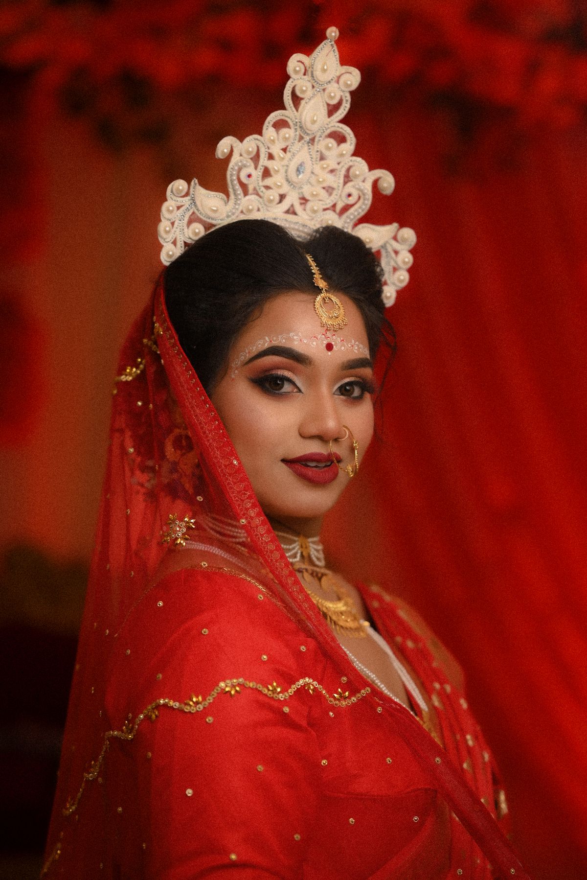
Photo: Pexels · License. Illustrative stock photography; pictured people, products and settings are not claimed to demonstrate this exact guide or endorse this publication.
Decide whether you want warmth or sculpting
Bronzer and contour are often discussed together, but the visual goal can be different. Choose the effect first: a warmer-looking complexion, a little dimension or a more deliberate shadow. You do not need both products. This guide focuses on soft optional bronzer rather than changing the apparent structure of the face.
Compare shade and undertone
A product that looks orange or too deep may need a different shade rather than more blending. Assess a legitimate swatch with the base you intend to wear. Brand shade names are not standardized. A softer or less warm-looking option can be worth comparing, but no single undertone formula suits every person or product range.
Check the finish
Matte, softly luminous and visibly shimmery products create different effects. Look at the finish in the lighting where you expect to wear it. A reflective bronzer may be enjoyable but less suitable for a precise shadow effect. Choose deliberately rather than treating every brown powder as interchangeable.
Use a clean controllable brush
Pick a brush that fits the area you want to color without depositing a dense stripe. Begin with a small amount and light pressure. Brush shape is useful because it changes control, not because a luxury tool is required. Keep the application manageable enough that the first pass can be assessed before another is added.
Place selected areas rather than a compulsory map
Choose where you want warmth and begin there. A broad perimeter sweep is an option, not a rule. Keep hairline and jaw boundaries soft if you work near them. Check the face straight on and from the side so the result does not look like an isolated band in one view.
Blend the edge without expanding endlessly
Work the boundary with a lighter touch and a clean suitable tool if needed. Do not move the product farther down the neck simply to hide a mismatched color. If the shade is wrong, remove or simplify the application. Edge control can improve placement, but it cannot transform the underlying pigment into the intended shade.
Balance with cheek color
If you also use blush, assess how the two areas meet before adding more. They can remain distinct without a hard border. A warm bronzer plus a strong blush may create more overall color than you intended. Look at the whole face at ordinary distance rather than perfecting each product in isolation.
Troubleshoot the first cause
If the result is orange, compare shade; if it is patchy, compare surface preparation, amount and tool; if it is heavy, reduce placement. Change one factor at a time. This keeps a simple cheek step from becoming an expanding set of corrective layers and makes the next trial more useful.
A worked application example
A bronzer looks orange on you even after careful blending. That is a shade-choice problem, so adding more blending time may only spread the orange farther. Compare a different undertone or depth through a hygienic sample instead. If the shade is suitable but the edge is strong, work with a smaller amount and a softer boundary. Keep bronzer distinct from contour if you do not want a sculpted effect. Your aim can be a little warmth in selected areas, without following a face map that covers every perimeter by default.
Make the next application easier
Keep a short note of the exact products, tools, placement and amount that helped you add an optional warm-looking dimension while keeping the color and edge controlled. If the first attempt was difficult, name the actual problem before changing the routine. Shade, excessive quantity, an unsoftened boundary and an incompatible sequence are different questions. A local correction or a simpler look may solve more than another full layer. Recheck current directions if you replace a formula.
Your working checklist
Checkmarks stay in this browser when storage is available. They do not submit information or complete a purchase.
Put it into practice
- Define the intended effect: add an optional warm-looking dimension while keeping the color and edge controlled. Keep one feature or placement task as the priority.
- Prepare according to the first two sections, especially “Compare shade and undertone,” using the exact formula's directions.
- Start with a small controlled amount and follow the placement decision in “Check the finish.”
- Work through “Use a clean controllable brush” and check the result before loading the tool again.
- Use “Place selected areas rather than a compulsory map” to refine the boundary or sequence; do not enlarge the whole application to hide one small mistake.
- Compare both sides or related areas under similar light, using “Blend the edge without expanding endlessly” as the next decision.
- Make only the local adjustment needed, then use “Troubleshoot the first cause” to save a simpler repeatable version.
Before you finish
- The final effect supports the aim to add an optional warm-looking dimension while keeping the color and edge controlled, with no additional steps added only by habit.
- Products are used only on the areas and in the ways their current labels permit, especially around eyes.
- The result has been checked at ordinary distance as well as in a close mirror; normal texture and natural asymmetry are allowed.
- Tools are clean, removal is appropriate and any product causing irritation has been stopped rather than covered by more makeup.
Common questions
Do I need all the products mentioned?
No. Use the smallest combination that helps you add an optional warm-looking dimension while keeping the color and edge controlled. Tools and optional finishing products are examples, not a compulsory shopping list. If a familiar product and a clean suitable applicator already give the effect you want, a larger matching collection is unnecessary.
What should I change if the first attempt looks wrong?
Identify whether the problem is color, amount, placement or the behavior of the product combination. Revisit “Place selected areas rather than a compulsory map” and change one relevant detail in a later trial. Adding more product across the whole area can hide the cause and make a small correction much harder.
Should my result look identical to a tutorial photograph?
No. Lighting, camera processing, product choices and natural facial differences affect the appearance. This guide provides decisions and techniques rather than a promised before-and-after result. Use a relaxed expression and useful light to judge whether you like the effect in ordinary life, not whether every detail matches a studio image.
Can I use a similar-colored product from another makeup category?
Only if that specific product's label permits the area and use. A lip, cheek or craft pigment is not automatically suitable around the eyes. Follow the current manufacturer directions and relevant FDA eye-cosmetic guidance. Similar color is a visual relationship, not proof that products have interchangeable uses.