How to Create a Soft Monochrome Makeup Look Without Using One Product Everywhere
The aim is to coordinate related colors while respecting each product's labeled use area. This is an original practical application guide, supported by the linked manufacturer education and relevant FDA guidance; it does not claim a tested transformation or a result that will be identical on every face. Use the exact products' current directions, choose the amount of makeup you personally enjoy and keep normal texture visible if that is your preference. A useful routine can be small, and every decorative step remains optional.
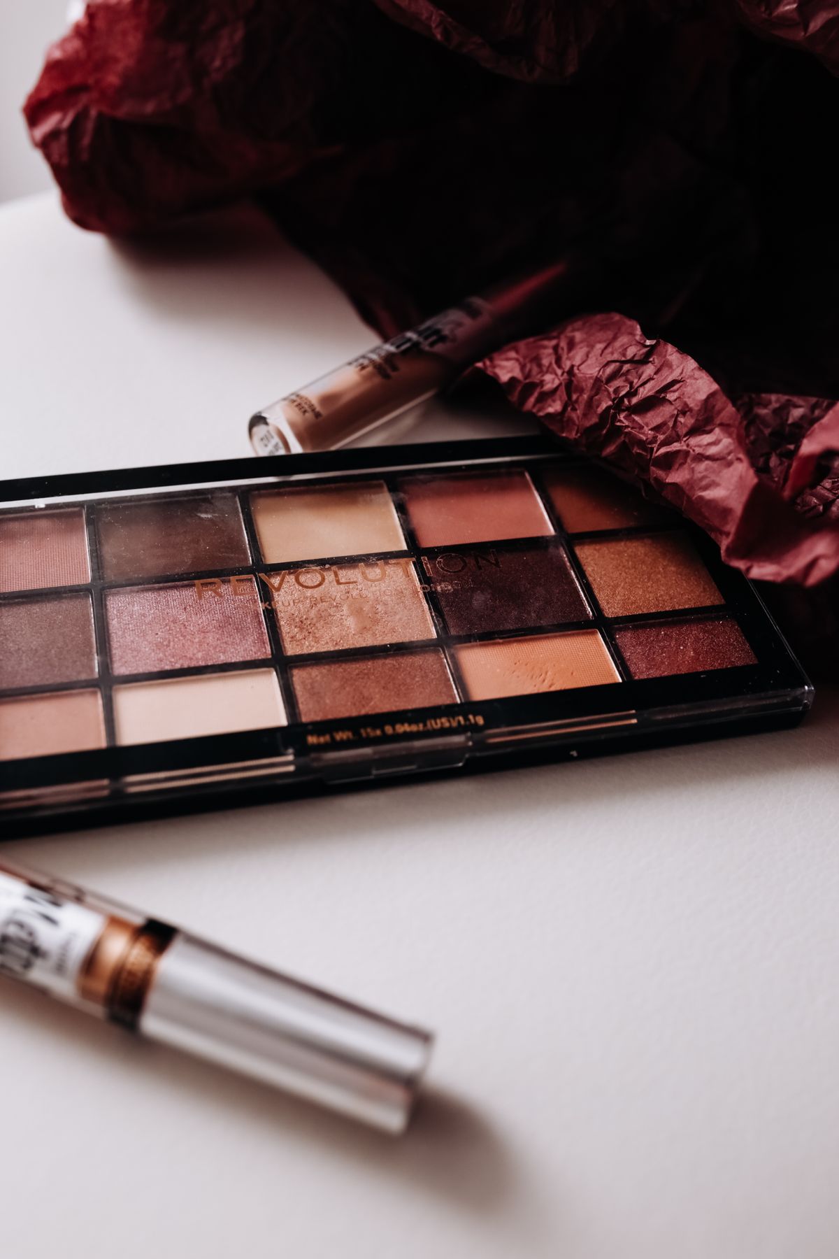
Photo: Pexels · License. Illustrative stock photography; pictured people, products and settings are not claimed to demonstrate this exact guide or endorse this publication.
Choose a color relationship
Pick a broad family such as muted rose, warm peach or soft brown, using shades you personally enjoy. Monochrome does not require identical pigment strength in every area. Decide which feature will be most defined and let the others support it. A clear intensity plan prevents a coordinated look from becoming equally heavy everywhere.
Respect labeled use areas
Use products intended for each area. A lipstick or blush is not automatically appropriate near the eyes, even if the color looks ideal. The FDA notes that color-additive permissions differ for eye use. Only use a multipurpose product across areas that its current label actually permits, and follow its directions.
Compare shades together
Place the actual products near each other or make hygienic swatches where appropriate. Packaging color and online photographs may be misleading. Look for a relationship in warmth, depth or muted quality rather than an exact match. If one product is much brighter than the others, decide whether it should become the focal point or be replaced.
Keep the base restrained
Apply the familiar complexion steps you want without adding extra coverage solely because the look has a theme. A simpler base can make the color relationship easier to see. Follow each formula's directions and keep preparation consistent. The coordinated effect comes from chosen colors and placement, not a compulsory full-face foundation layer.
Place cheek color gradually
Use a small controlled amount and soften the edge before adding more. Check the color with the intended lip product nearby or already applied. The cheek may need less intensity once the lip is stronger. Do not judge each feature in isolation and then discover that the finished face has more overall color than you wanted.
Use an eye-safe version of the theme
Choose a suitable shadow with the degree of contrast you want. A soft wash or narrow definition can be enough. Check with relaxed eyes and keep the boundary controlled. You do not need to use the exact cheek shade on the lid to establish coordination, and a separate eye product can be the clearer safer choice.
Set the lip intensity deliberately
A sheer tint, soft lipstick or more defined lip can each fit the theme. Use the formula as directed and check corners and edges. If lips become the focal point, reduce another area's intensity if that suits your preference. A coordinated look can contain variation in finish as well as depth.
Review the whole face
Step back and assess the color relationship under useful light. If the effect is too uniform, soften one area rather than changing everything. Keep the exact successful products in a note. The look can remain flexible as your preferences change; it does not require buying a complete matching collection from one brand.
A worked application example
You like a muted rose theme across cheeks, lips and eyes. Use an eye-safe shadow for the eyes, a cheek product for the cheeks and a lip color for the mouth unless a specific product is expressly labeled for multiple areas. The shades do not need to be identical. A softer cheek and a deeper lip can still feel coordinated through their related color character. If the result looks too uniformly strong, reduce one area's intensity instead of adding a contrasting product automatically. Coordination is a visual choice, not permission to ignore product-area restrictions.
Make the next application easier
Keep a short note of the exact products, tools, placement and amount that helped you coordinate related colors while respecting each product's labeled use area. If the first attempt was difficult, name the actual problem before changing the routine. Shade, excessive quantity, an unsoftened boundary and an incompatible sequence are different questions. A local correction or a simpler look may solve more than another full layer. Recheck current directions if you replace a formula.
Your working checklist
Checkmarks stay in this browser when storage is available. They do not submit information or complete a purchase.
Put it into practice
- Define the intended effect: coordinate related colors while respecting each product's labeled use area. Keep one feature or placement task as the priority.
- Prepare according to the first two sections, especially “Respect labeled use areas,” using the exact formula's directions.
- Start with a small controlled amount and follow the placement decision in “Compare shades together.”
- Work through “Keep the base restrained” and check the result before loading the tool again.
- Use “Place cheek color gradually” to refine the boundary or sequence; do not enlarge the whole application to hide one small mistake.
- Compare both sides or related areas under similar light, using “Use an eye-safe version of the theme” as the next decision.
- Make only the local adjustment needed, then use “Review the whole face” to save a simpler repeatable version.
Before you finish
- The final effect supports the aim to coordinate related colors while respecting each product's labeled use area, with no additional steps added only by habit.
- Products are used only on the areas and in the ways their current labels permit, especially around eyes.
- The result has been checked at ordinary distance as well as in a close mirror; normal texture and natural asymmetry are allowed.
- Tools are clean, removal is appropriate and any product causing irritation has been stopped rather than covered by more makeup.
Common questions
Do I need all the products mentioned?
No. Use the smallest combination that helps you coordinate related colors while respecting each product's labeled use area. Tools and optional finishing products are examples, not a compulsory shopping list. If a familiar product and a clean suitable applicator already give the effect you want, a larger matching collection is unnecessary.
What should I change if the first attempt looks wrong?
Identify whether the problem is color, amount, placement or the behavior of the product combination. Revisit “Place cheek color gradually” and change one relevant detail in a later trial. Adding more product across the whole area can hide the cause and make a small correction much harder.
Should my result look identical to a tutorial photograph?
No. Lighting, camera processing, product choices and natural facial differences affect the appearance. This guide provides decisions and techniques rather than a promised before-and-after result. Use a relaxed expression and useful light to judge whether you like the effect in ordinary life, not whether every detail matches a studio image.
Can I use a similar-colored product from another makeup category?
Only if that specific product's label permits the area and use. A lip, cheek or craft pigment is not automatically suitable around the eyes. Follow the current manufacturer directions and relevant FDA eye-cosmetic guidance. Similar color is a visual relationship, not proof that products have interchangeable uses.